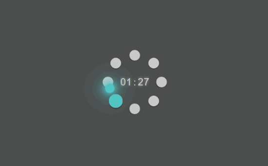
分享一个纯css实现的loading效果
纯css动态效果,没有一行javascript代码哦
大菊花+秒表代码
<div class="bg"></div>
 <div class="modal-loading">
    <div class="small1">
      <div class="small ball smallball1"></div>
      <div class="small ball smallball2"></div>
      <div class="small ball smallball3"></div>
      <div class="small ball smallball4"></div>
    </div>
    <div class="timer">
        <div class="cell">
            <div class="numbers tenminute movesix">0 1 2 3 4 5 6</div>
        </div>
        <div class="cell">
            <div class="numbers minute moveten">0 1 2 3 4 5 6 7 8 9</div>
        </div>
        <div class="cell divider"><div class="numbers">:</div></div>
        <div class="cell">
            <div class="numbers tensecond movesix">0 1 2 3 4 5 6</div>
        </div>
        <div class="cell">
            <div class="numbers second moveten">0 1 2 3 4 5 6 7 8 9</div>
        </div>
    </div>
    <div class="small2">
      <div class="small ball smallball5"></div>
      <div class="small ball smallball6"></div>
      <div class="small ball smallball7"></div>
      <div class="small ball smallball8"></div>
    </div>
    <div class="bigcon">
      <div class="big ball"></div>
    </div>

</div>
.modal-loading{display:block;position:fixed;top:0%;background:#fff;z-index:2001;left:50%;opacity:0.7;top: 30vh;}
.bg{display:block;position:fixed;width:100%;height:100%;background:#000;z-index:2000;top:0;left:0;opacity:0.7;}
.small2 {
  position: absolute;
  height: 100px;
  width: 100px;
  background-color: transparent;
  /*top: 30vh;*/
  left: 50%;
  transform: translate(-50%, -50%);
}

.small1 {
  position: absolute;
  height: 100px;
  width: 100px;
  /*top: 30vh;*/
  left: 50%;
  transform-origin: center;
  transform: translate(-50%, -50%) rotate(45deg);
  background-color: transparent;
}

.bigcon {
  position: absolute;
  height: 95px;
  width: 95px;
  /*top: 30vh;*/
  left: 50%;
  transform-origin: center;
  transform: translate(-50%, -50%) rotate(-45deg);
  background-color: transparent;
  animation: bigcon 2s infinite linear;
  animation-delay: 0.25s;
}

.ball {
  border-radius: 50%;
  position: absolute;
}

.small {
  width: 22px;
  height: 22px;
  animation: small 2s infinite ease;
  box-shadow: 0px 2px rgba(0,0,0,0.3);
   background-color: #46b9ff;
}

.small:nth-child(1) {
  top: 0%;
  left: 0%;
}

.small:nth-child(2) {
  top: 0%;
  right: 0%;
}

.small:nth-child(3) {
  right: 0%;
  bottom: 0%;
}

.small:nth-child(4) {
  bottom: 0%;
  left: 0%;
}

.big {
  width: 20px;
  height: 20px;
  border-radius: 15px;
  box-shadow:0px 0px 10px #54f7f8, 0px 0px 20px #54f7f8, 0px 0px 30px #54f7f8, 0px 0px 50px #54f7f8, 0px 0px 60px #54f7f8 ;
  z-index: 1;
  background-color: #54f7f8;
  animation: bigball 1s infinite linear;
}

.smallball1{
  animation-delay: -1.75s;
}
.smallball6{
  animation-delay: -1.5s;
}
.smallball2{
  animation-delay: -1.25s;
}
.smallball7{
  animation-delay: -1s;
}
.smallball3{
  animation-delay: -0.75s;
}
.smallball8{
  animation-delay: -0.5s;
}
.smallball4{
  animation-delay: -0.25s;
}
.smallball5{
  animation-delay: -0s;
}

@keyframes bigcon {
  0% {
    transform-origin: center;
    transform: translate(-50%, -50%) rotate(45deg);
  }
  100% {
    transform-origin: center;
    transform: translate(-50%, -50%) rotate(405deg);
  }
}

@keyframes small {
  0% {
    transform: scale(1);
     background-color: #fff;
  }
  10% {
    transform: scale(1.3);
    background-color: #54f7f8;
  }
  15% {
    transform: scale(1);
  }
  25%{
transform: scale(1);
     background-color: #fff;
  }
  100%{
    transform: scale(1);
     background-color: #fff;
  }
}

.timer {
    position: absolute;
    width: 100px;
    margin-top:-20px;
    margin-left: -30px;
    transform-origin: center;
    background-color: transparent;
    padding: 0;
    text-align: center;
    overflow: hidden;
    display: inline-block;
}

.cell {
    width: 0.60em;
    height: 40px;
    font-size: 20px;
    overflow: hidden;
    position: relative;
    float: left;
}

.numbers {
    width: 0.6em;
    line-height: 40px;
    font-family: digital, arial, verdana;
    text-align: center;
    color: #fff;

    position: absolute;
    top: 0;
    left: 0;

    text-shadow: 0 0 5px rgba(255, 255, 255, 1);
}

.timer .numbers {animation-play-state: running;}

.moveten {
    animation: moveten 1s steps(10, end) infinite;
    animation-play-state: paused;
}
.movesix {
    animation: movesix 1s steps(6, end) infinite;
    animation-play-state: paused;
}


.second {animation-duration: 10s;}
.tensecond {animation-duration: 60s;} /*60 times .second*/

.minute {animation-duration: 600s;} /*60 times .second*/
.tenminute {animation-duration: 3600s;} /*60 times .minute*/

@keyframes moveten {
    0% {top: 0;}
    100% {top: -400px;}
}

@keyframes movesix {
    0% {top: 0;}
    100% {top: -240px;}
}
效果